Case study
Payra
An e-wallet, one flow done properly.
Payra started as a full e-wallet built from a Figma design: onboarding, bills, top-ups, a profile. Then I cut it down to the one flow people actually judge a wallet on, sending money, and spent the time making that feel right. Every icon, card mark and illustration is exported from the Figma file, and the light theme matches the style guide one to one.
- Year
- 2026
- Role
- Design to code, solo
- Platform
- iOS & Android
The send-money flow
- 01
Home and balance
- 02
Pick a contact
- 03
Enter the amount
- 04
Confirm with your PIN
- 05
Success, balance updated
The screens
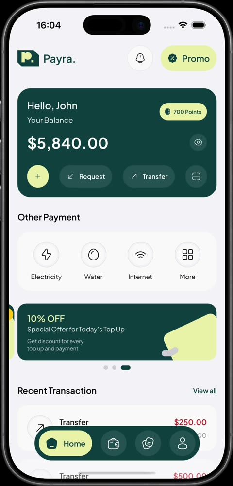
01Home: balance, quick actions and recent transactions. 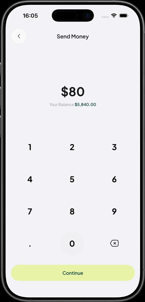
02The keypad shows what you can afford as you type. 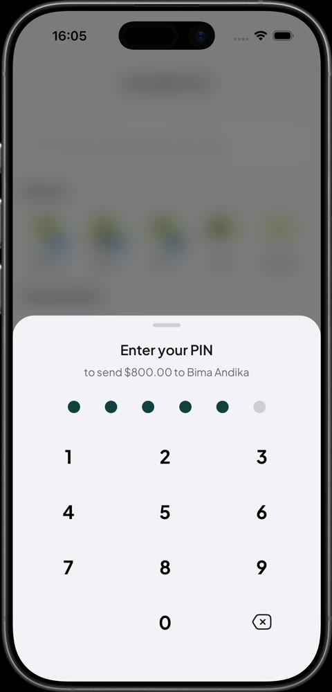
03The PIN slides up in a sheet over the amount. 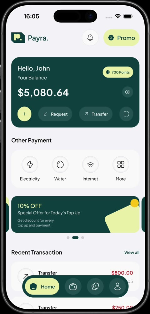
04Back home, the balance and history already reflect the transfer.
Details worth a look
- 01
A privacy shield like a real bank app
The moment the app stops being active, swiping to the app switcher or pulling down a notification, the screen blurs under a brand tint with the logo. It appears with no animation because iOS takes its snapshot instantly, then fades away when you come back.
- 02
A balance you can hide
The eye icon from the Figma file gets a slash that draws across it while the balance is hidden, rather than swapping between two icons.
- 03
Feedback you can feel
The keypad warns about an overdraft before you hit Continue, and the phone gives a haptic tap when something goes wrong or a transfer goes through.
- 04
A Live Activity on the Lock Screen
Payments show up as an iOS Live Activity, through a small native Expo module written for the app.
- 05
Theming that lives on the native side
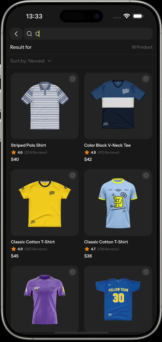
Styles are Unistyles 3 sheets that react to theme and safe-area changes natively. Light mode is the Figma style guide; dark mode is an extra I designed on top.
Built with
- Expo SDK 57
- React Native
- Unistyles 3
- Reanimated 4
- Zustand
- Expo Router
- React Compiler
Next case study
Metiyu →